
YO! TEA
有茶
2017 · SHENZHEN 深圳
STRATEGY 品牌策划 / VI 视觉形象升级
随着新茶饮的火热,有茶在水果茶市场中广受好评,但由于该品类的产品技术壁垒不高,该品牌在市场上容易被山寨,同时还存在着品牌个性模糊、精神内核缺失、视觉形象混乱、品牌印记缺失等问题。
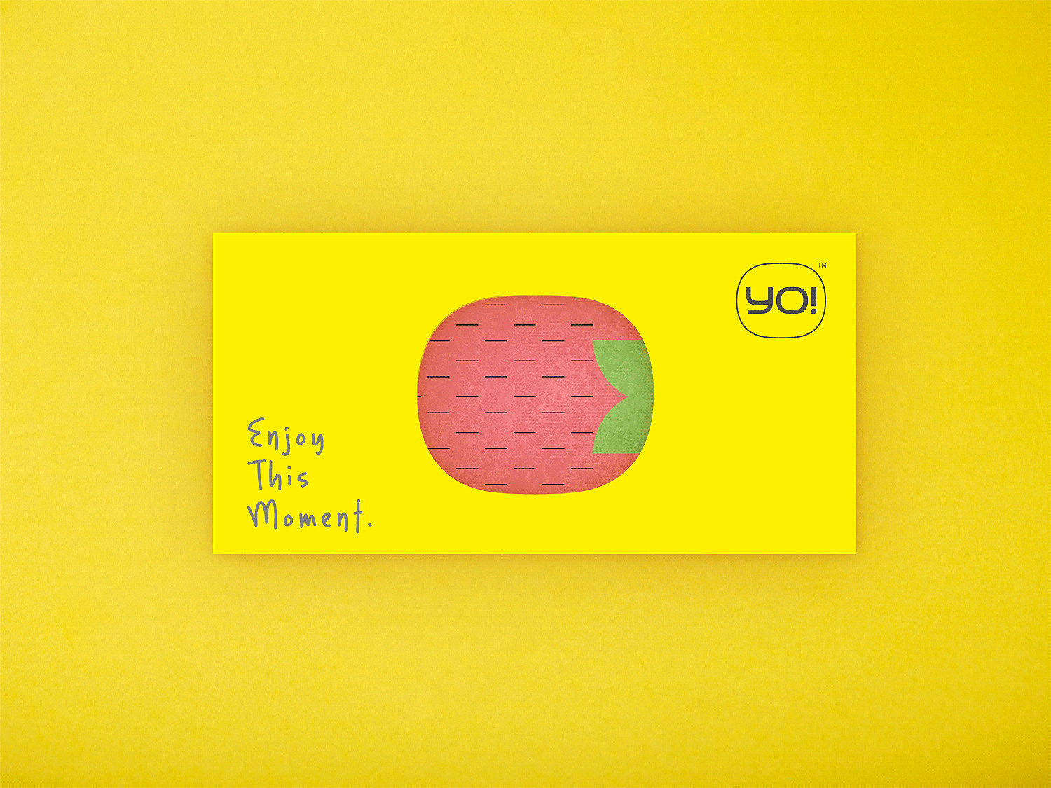
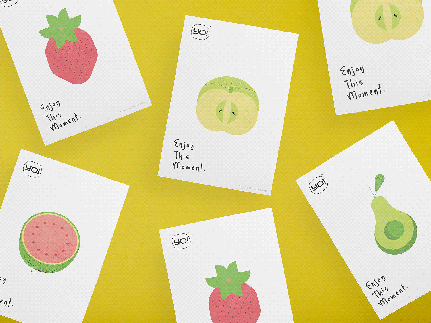
有茶创建于一个高速发展的创新型城市——深圳,当下的休闲餐饮消费主力人群九零、九五后对餐饮健康化的要求日渐提升,追求新鲜感、需求多样化、并热衷在社群网络上“打卡”,有茶需要在这一背景下聚焦品牌核心。我们由产品特性出发,挖掘有茶的核心价值为“爽快”,它不仅是产品最大的特征,也是其企业管理运作与团队精神的特征。结合年轻一代群体的特征,我们提炼出“乐享水果茶Enjoy this moment”的品牌理念,并围绕“有趣、爽快、专注”的品牌基因进行品牌视觉形象升级。
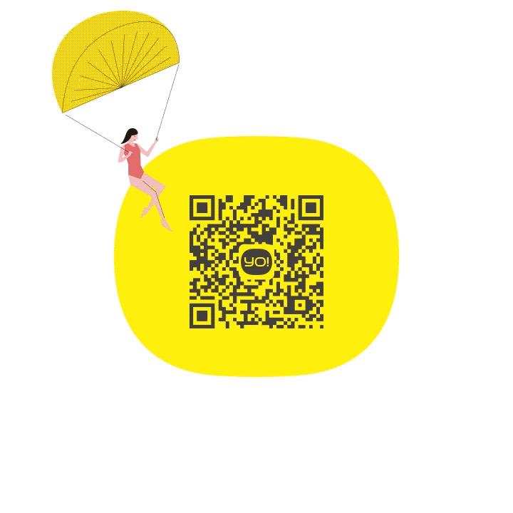
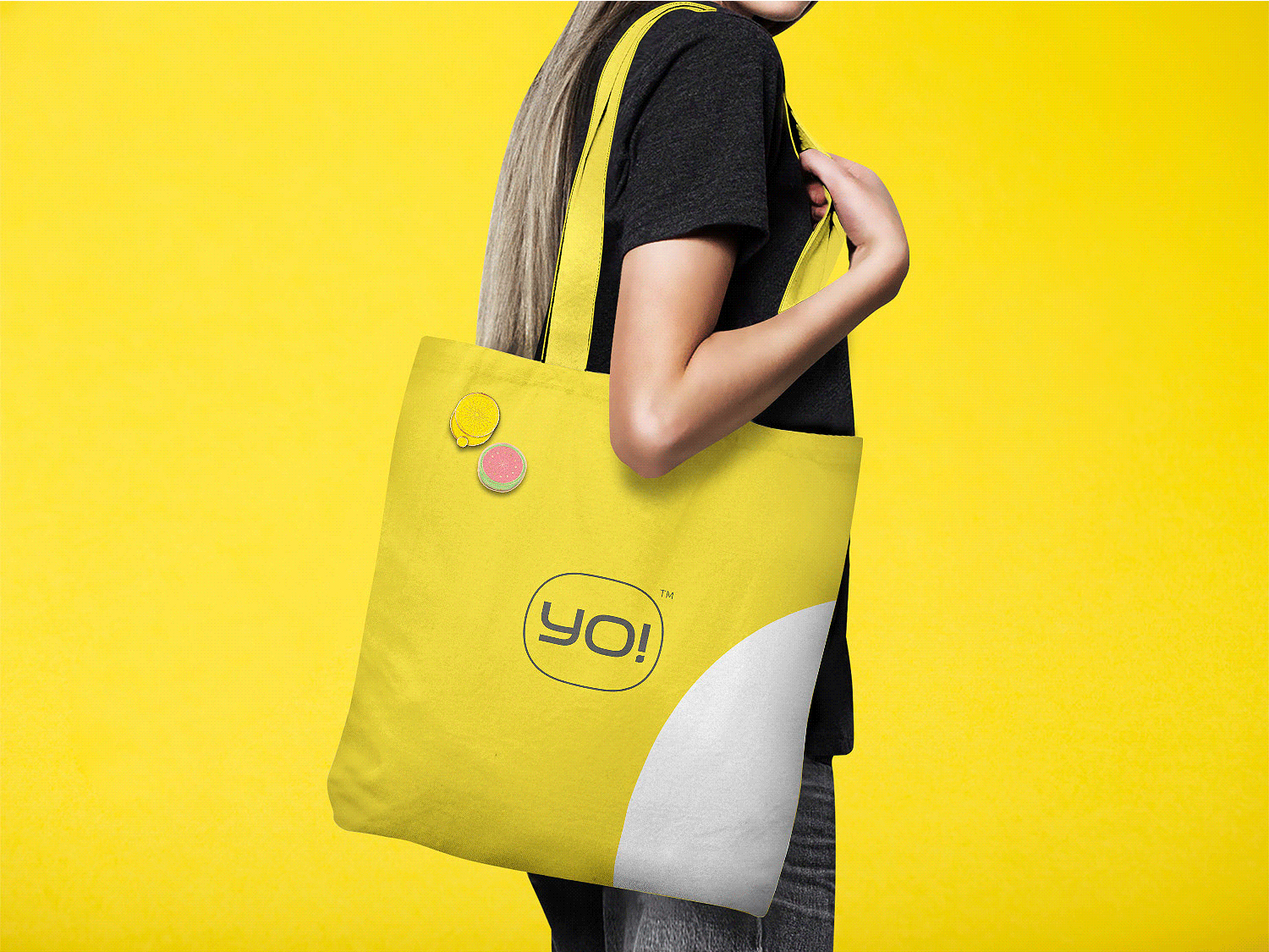
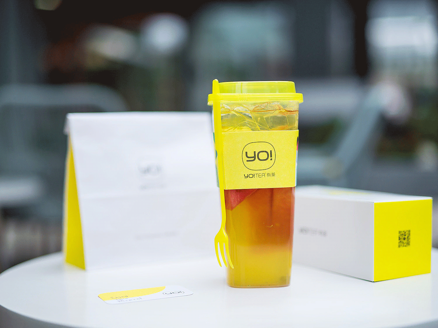
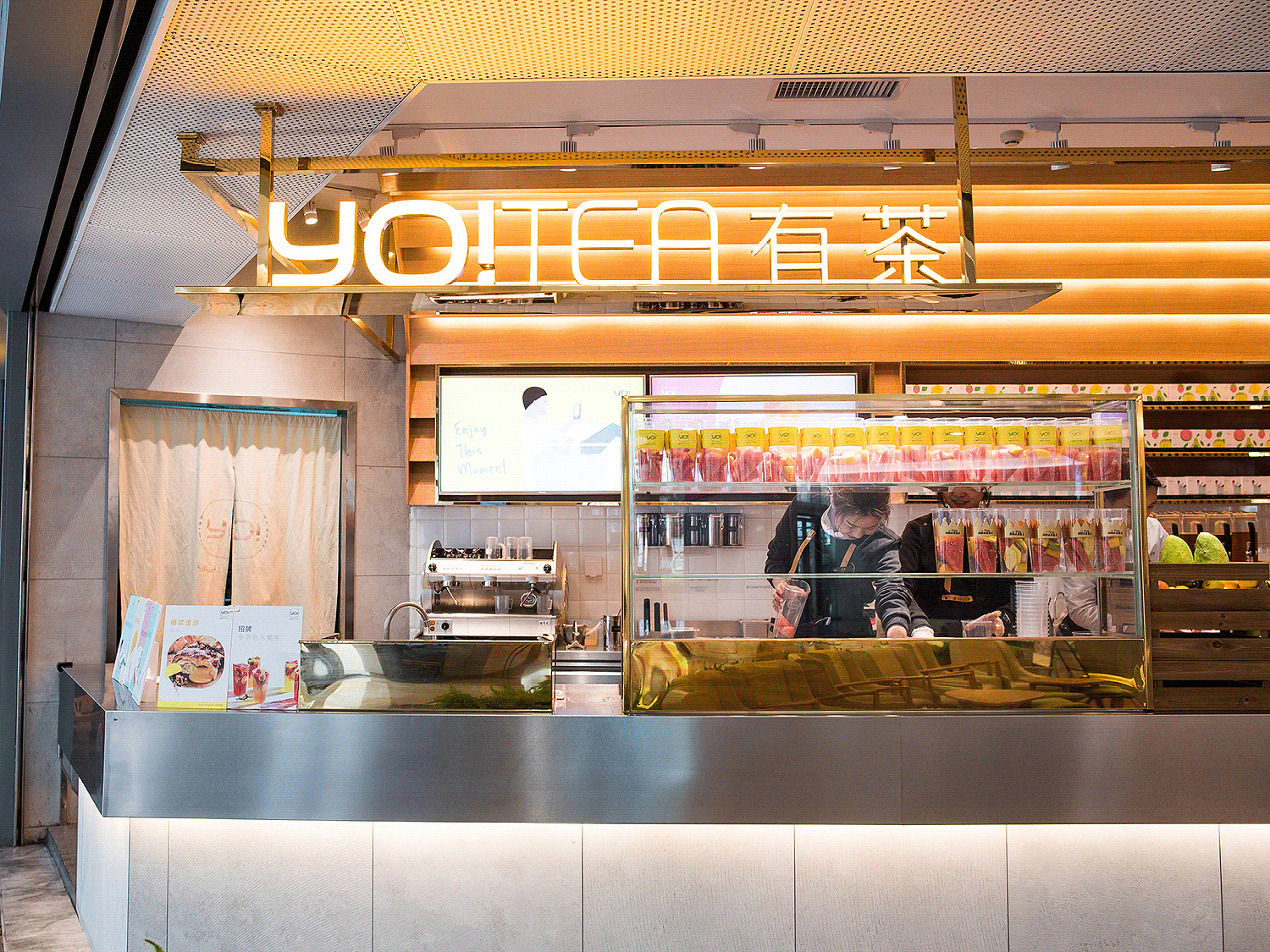
在视觉上,我们选用了有茶的专利——方杯的造型作为品牌印记。
· Logo造型来自有茶方杯外形,“YO!”呈现爽快、热情、积极的品牌个性,采用图标加英文字的组合形式表达纤细而平衡的整体视觉感受。
· 色彩以柠檬黄为主,整体物料设计明快干净,简洁清爽。
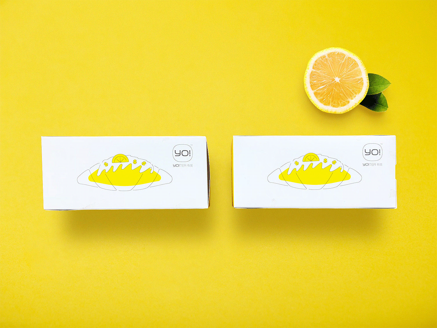
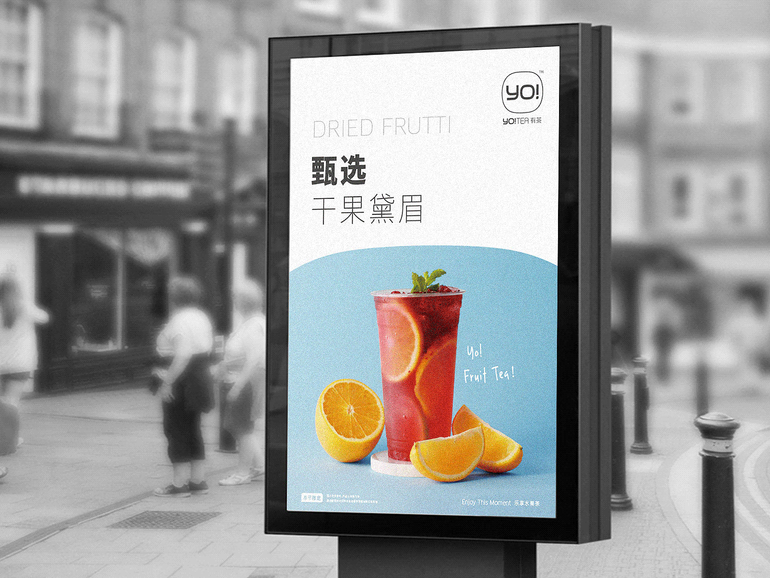
· 为了更好地与消费者沟通,我们将水果茶原材料与消费场景以扁平化手绘插画形式呈现,表现品牌轻松、畅快的调性。
As the new type of tea is becoming more and more popular, YO TEA has been highly recommended by customers in the market of fruit tea. However, as the technique of fruit tea is not difficult, it’s so easy for other competitors to intimate. Meanwile, YO TEA has a vague brand awareness among customers, lack of core brand ideas and brand image, which makes it urgent to upgrade its branding.
YO! TEA is created in a fast-growing and innovative city, Shenzhen. The main consumer groups, including the 90s and 95s, have a rising need for healthy and fresh food. Moreover, it becomes a trend among young people to check-in cool places and good restaurants. Under this situation, we need to find the core brand idea for YO!TEA.
According to the characteristics of fruit tea, we found that the core feature is “ refreshing”, which is also the operational and team spirit of this company. Integrating the characteristics of young adults and fruit tea, we reach a brand idea that is “ enjoy this moment”. The visual identification system is also upgraded by following the spirit of “ interesting, freshing and concentrated” from YO! TEA.
On visual design, we use the patent of YO! TEA, which is a square cup shape as the main outline of its logo.
- “YO!” represents the idea of passion, positive attitude and freshness. This logo reaches a great balance with both the text and icon working together.
- It uses lemon yellow as the main color and the overall design is simple, clean and vivid.
- In order to enhancing the interaction with consumers and representing the relaxing and joyful ambience, we use flat hand illustration to restore the purchasing scenarios and origin materials of the fruit tea.


RELATED PROJECTS 相关案例


