
XIAO QIAO MEI NOODLE
小桥妹 · 山城牛肉面
2016 · SHENZHEN 深圳
STRATEGY 品牌梳理 / VI 视觉系统 / SI 空间设计
基于市场需求的膨胀以及技术上的经验积累,福客瞄准重庆小面这一品类,成立了新品牌“小桥妹”,欲借助其广阔的市场机会助推福客新一轮的扩张及发展。
重庆小面虽然属于地方特色传统小吃,但具备品牌意识及标准化运作管理是餐饮品牌发展的基础。同时,小桥妹新品牌创建工作还需思考:如何在呈现重庆地方传统特色的同时也能迎合年轻、时尚的都市消费群体的消费需求。
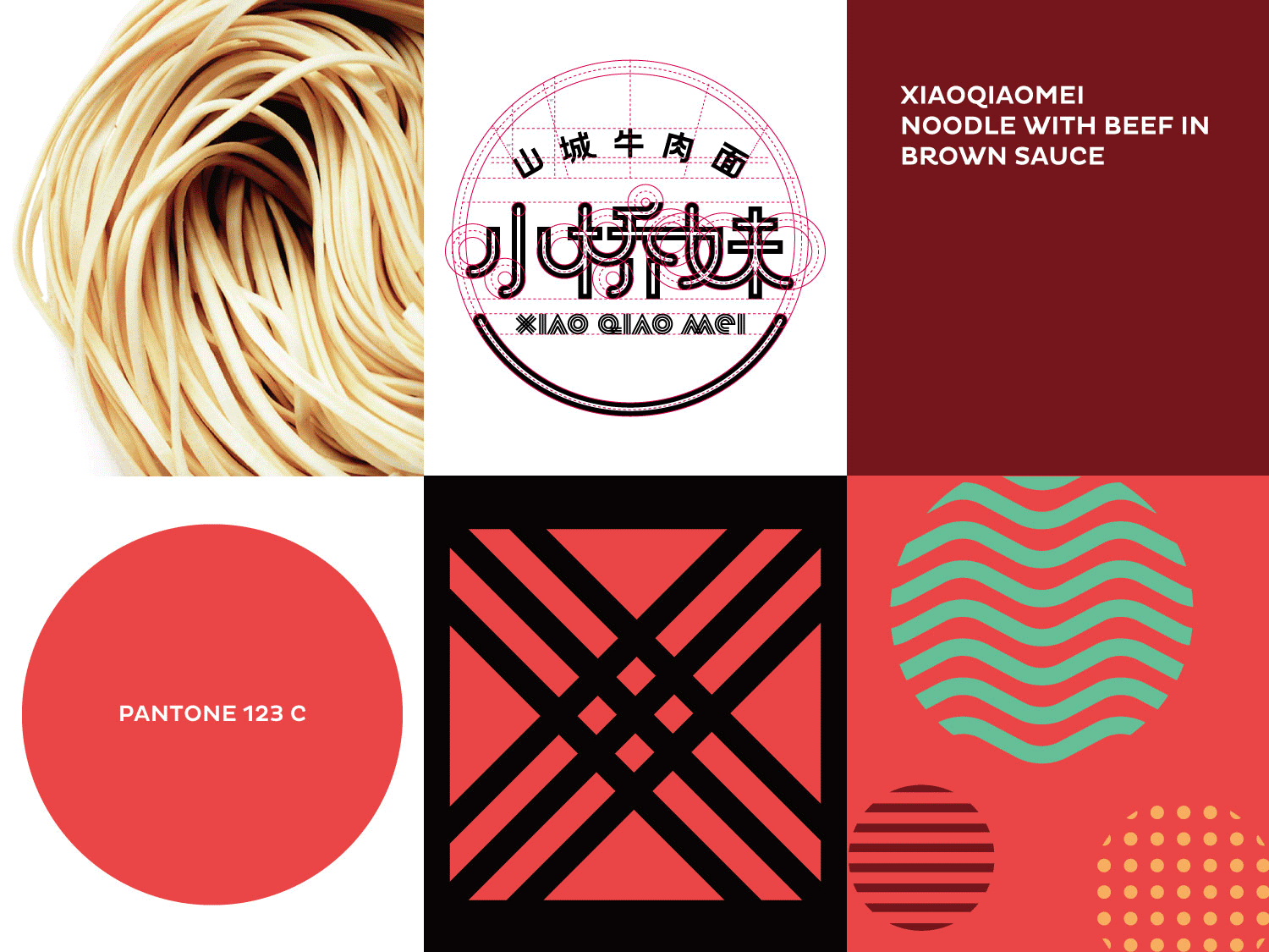
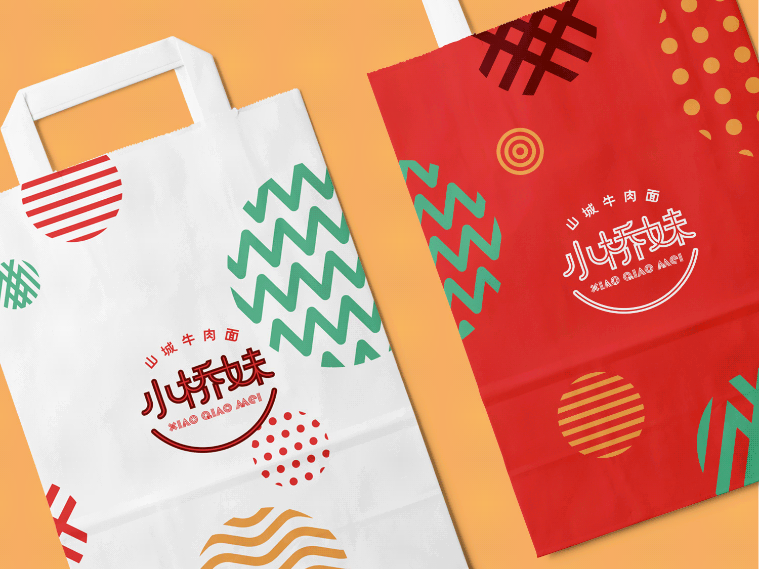
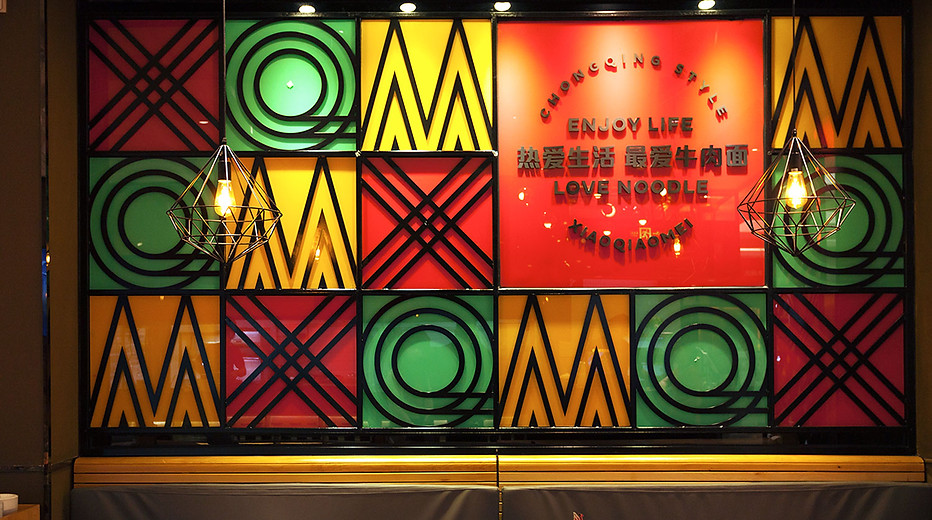
小桥妹品牌视觉设计偏向新中式的手法,呈现一个现代、都市的形象,在继承小面传统美味的同时也符合现代年轻人的审美。品牌标志以图标(印章)的结构,表达品牌的产品质量保证;视觉延展则采用线条和字母组合成不同的纹样进行设计;色调以红色为主,并结合鲜明的辅助色,呈现活跃、刺激的视觉感受;空间内使用了大幅的手绘画还原古时重庆集市情景。整个品牌视觉形象及空间调性共同呈现一个清新、舒适并具备时尚感的特点,以区别于其它同品类品牌的传统风格。
Based on an explosive growth in market demand and years of technical experience, Fook aims to developing “Chongqing XiaoMian” into a new noodle brand “XIAO QIAO MEI NOODLE” so as to use the fast-growing market opportunities to promote a new round of expansion and development of FOOK.
Chongqing XiaoMian is a traditional snacks originated from Chongqing, but the development of a catering brand bases on brand awareness and standard operation and management. While we upgrade this new brand “XIAO QIAO MEI”, we need to work out how to occupy the minds of young adults consumers while still keep the characteritics of Chongqing traditional snacks.
The vision identity design of XIAO QIAO MEI represents a modern and urban image with new Chinese style. It meets the aesthetics of modern young adults while keeping the Chongqing tradition. The logo uses an official stamp as its main structure to represent the good quality of the product. The expanded design of it is patterns combined with lines and letters. The main brand color is red, with other bright colors as sub colors to represent a vivid and lively feeling. Large hand drawing on the wall shows a glimpse of market scene in ancient Chongqing. The overall visual and spacing design display a refreshing, comfortable and modern style that is different from other traditional styles.


RELATED PROJECTS 相关案例


