
JAT BAAT LUCK C
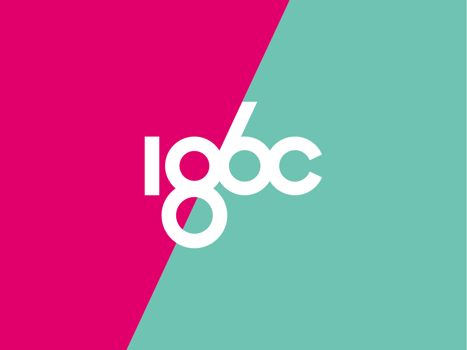
186C茶
2016 · GUILIN 桂林
STRATEGY 品牌策划 / VI 视觉系统 / PACKAGE 包装设计 / SPACE 空间设计
186C是一个全新的、具有现代生活方式理念、具备国际化视野的中国茶品牌。在传承中国茶饮文化的同时186C通过技术创新,萃取茶颗粒,打造一个契合全球化移动生活方式的茶饮品牌,并重塑茶的感观、体验与价值,希望让更多的朋友了解和喜欢中国茶。
在竞争激烈的茶饮品牌市场、瞬息万变的消费者需求的大背景下,打造一个具有“中国茶·世界风”特点,并通过品牌理念、品牌视觉形象及空间一体化呈现186C品牌个性是本次项目的核心重点。通过186C,为消费者创新茶饮消费体验。
186C基于传统进行产品创新,其产品最大的特色是“混合”茶颗粒。“混合”不仅是创新,也代表一种态度,品牌主张“中国精萃·世界好茶”也寓意186C是中西方文化相互交融的品牌,因此,我们将“混合”的特色作为本案的核心概念并延伸至视觉表现上。
186C is a brand new Chinese tea brand with an international view and guided by a contemporary lifestyle. The founder try to develop 186C as a tea brand that meets with the worldwide mobile lifestyle by implementing their innovative extracting techniques into tea production. While keeping the tradition of Chinese, 186C wants to rebuild the drinking experience, idea and value of tea, and make more people get to know what is Chinese tea and fall in love with it.
Under the fierce competition in the tea market and the situation of a rapidly changing consumer demand, the core of this project is to create a brand that represents the idea of “ Chinese tea, Worldwide style”. In order to display this idea, we need to create a visual indentification system and relevant spacing design to provide consumers with a new experience.
- 品牌名称186C选自国际PANTONE色卡里的“中国红”;
- 186C视觉设计调性参考民国早期商业广告的东西方文化互融的混搭视觉美学;
- 品牌的识别标志体系根据产品品类的不同特征,结合东西方对数字的不同表现手法,统一规范品牌的产品线;
- 产品命名来自混合茶色所对应的色卡名称;
- 颜色上则采用多色彩的碰撞,也是种“混合”的表现;
- 空间方面,则将东方的简约写意空间表达和西方的冷静阵列式构成感结合呈现。
Based on the Chinese tradition, 186C creates mixed tea as its main product. “Mixed Tea” represents the attituede toward innovation and a blend of Chinese culture and world culture with idea of“ China’s best and worldwide tea”. Therefore, we use “mix” as the core concept of this project and expand it through visual presentation.
- 186C names after the “China Red” in the international PANTONE color card.
- Brand visual design refers to the visual aesthetics from the republican period of China, an era that mixed the eastern and western culture into their advertising.
- According to the different characteristics of different tea products, the brand's identification system combines the different expressions of the East and the West on the numbers to integrate the product line.
- The names of tea products are derived from the colors in the international PANTONE color card.
- Different colors are put into use, which is also a kind of "mixed"
- In terms of spacing design, we combine the simpleness from the East with the checkerboard from the West to add a elegant and clean style to the store.


RELATED PROJECTS 相关案例


